The Carbon Map
An interactive “squishy map” exploring national responsibility for and vulnerability to climate change. Created for the Guardian and the World Bank Apps for Climate competition. Spring 2012.
The brief
Climate change responsibility is conventionally discussed in terms of national emissions or emissions per capita. But that is a very one-dimensional view, as it ignores crucial factors such as historical emissions – most of which are still in the air – and the international trade both in fossil fuels and goods produced using those fuels.
To give a more nuanced picture we set out to map where the carbon is taken out of the ground in the form of oil, coal and gas, where it gets burned and where the resulting goods and services are consumed, plus cumulative emissions from the last 150 years and one view of potential future emissions in the form of each country’s estimated stocks of fossil fuel.
Challenges
The conventional way to map national-level data is with a choropleth (shaded-in map). These are easy to make but they aren't particularly engaging or legible (a darkly shaded small country can look less prominent than a lightly shaded big country). In addition they allow you to view only at one dataset at once.
Another problem with interactive maps in general is that they can be a bit baffling for the user. There are lots of buttons and menus and markers but it can take a while for someone looking at it cold to work out what's going on.
Our approach
To make the data as engaging and clear as possible we decided to reinvent the area cartogram – a map which distorts the size and shape of nations to reflect the data being displayed. These have been popular in books, posters and online as still images, but we wanted to make them more tactile and legible by animating between different datasets. This was done with an SVG implementation of a publicly available algorithm by Mark Newman (which works, ingeniously, by simulating the diffusion of chemicals between areas, as described in this paper by Newman and Michael Gastner).
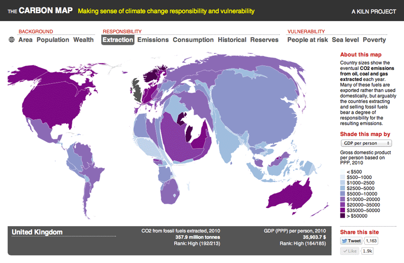
This approach makes it easy to see at a glance how each region or nation stands in terms of each metric. So here's historical emissions, for example, in which wealthy nations look relatively inflated – especially the UK, whose massive size reflects its pivotal roll in the coal-powered industrial revolution.

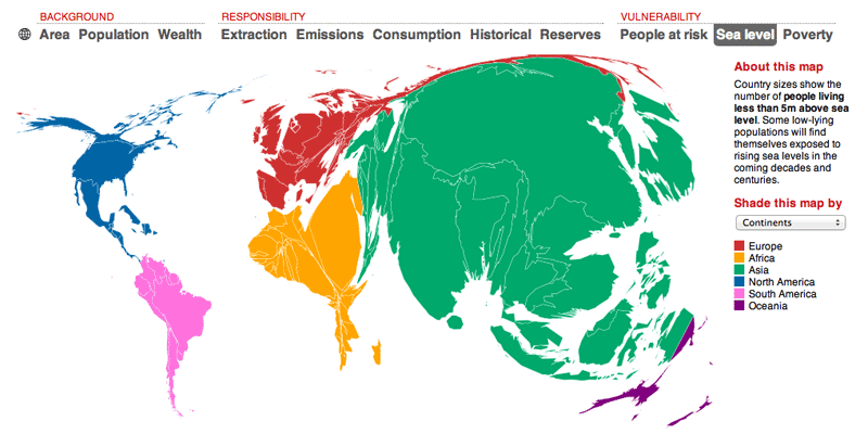
By contrast, on the vulnerability maps it's the poor world that looks too large. Here’s the world resized to show the number of people living less than five metres above sea level.
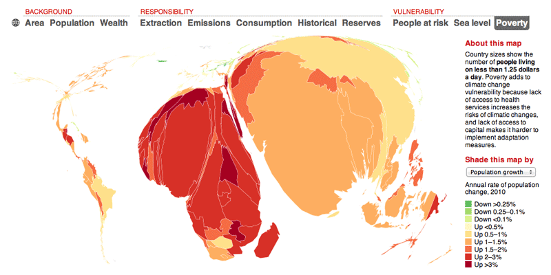
The other advantage of the interactive cartogram approach is that it allows the user to see how two different datasets correlate by allowing the maps to be shaded as well as distorted. For instance, if you shade the map by population growth and click between the various metrics, it's clear at once that high rates of population increase (the reddest areas) are very poorly correlated to carbon footprint…

… but very highly correlated to poverty.
Finally, we wanted to deal with the problem of interactive maps being baffling and expecting the user to do all the work in terms of working out what's going on. We thought about having an introductory video but that felt awkward. So instead, we decided to turn the whole map into a pseudo-video by adding a big play button that kick starts an audio introduction and moves the actual map in sync. This technique later became the basis of our Talkie toolkit.

Selected media coverage
Awards
Honourable mention, World Bank Apps4Climate.