OpenCorporates Maps
A visualisation of the Byzantine corporates structures of the world’s biggest banks and financial services companies. Created for OpenCorporates, summer 2013.
The brief
OpenCorporates is assembling the first open database of all the companies around the world. For now, their data is richest in the financial sector, home to global banks such as Goldman Sachs and Citigroup. Although we often think of them as corporate monoliths, these huge firms actually consist of thousands of subsidiaries located all over the world, many of them in tax havens. OpenCorporates asked Kiln to make these huge networks visually engaging and interactive.
Challenges
The main challenge with this project was working out a way to represent an incredibly large tree-style dataset that would both make sense visually and allow each company to be interacted with. There are many ways to represent smaller hierarchical networks, including D3’s force-directed graph tools. But when the dataset contains up to 5000 entries, each of which is tagged to a country, those techniques are impractical. For a start, the animations run hopelessly slowly with that many nodes. Moreover, force-directed graphs aren't ideal for conveying the geographical elements. Which is not to say the results can't look quite cool; here’s Goldman Sachs as a jellyfish.

Another approach would be to cluster the companies onto their parent countries on a normal map. But that wouldn't work either as there would be so many companies in a small country like the UK that they would inevitably overlap, making it impossible to interact with them individually, as this mockup shows.

Our approach
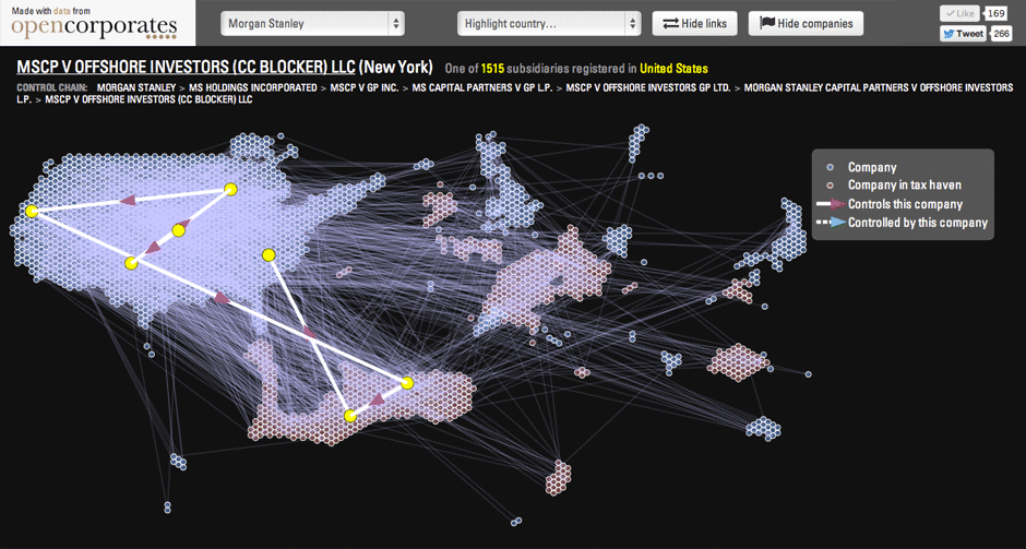
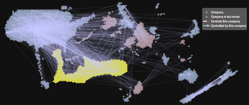
The solution we came up with after a day or two of experimenting was a new kind of cartogram map, provisionally dubbed a ‘Kilnogram’. It works by grouping the companies by country and then laying out each group in the shape of that country. To avoid overlaps the country is scaled up until it can accommodate enough circles, packed together honeycomb-style. So the US or UK for example are immediately recognisable due to their distinctive shapes, even though their size is determined by the data. Here’s the UK and Ireland.

The result is a map that shows the relative importance of each country and the density of connections between each country. So for example it shows at a glance the ridiculous prominence of the tax-haven Cayman Islands in the world of Goldman Sachs.
But because each company is individually visible and clickable, it’s ideal for interactivity: in this case browsing to see all the parents and children of each company, which are shown on hover. Some of the chains are amazingly long with some companies lying around 10 layers of ownership – and more than one tax haven – away from HQ.

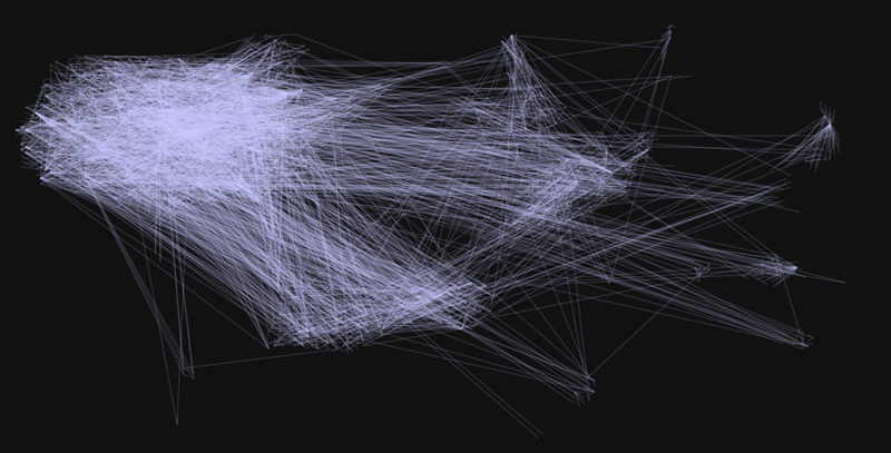
And just for fun … here’s the Goldman Sachs map showing only the links between companies, not the companies themselves. The result, which is rather beautiful, could almost be mistaken for a visualisation of global flight paths.